Designing a brand for clear, trusted health insights.
Background
Inuvi is an expert-led health and diagnostics group. What began as a niche insurance medical screening business has grown into a broader group with interconnected capabilities across health, laboratory and clinical services, including LiveSmart health assessments.
Each service line is a specialist in its own field: health assessments, mobile phlebotomy and medical evidence collection across the UK and Ireland; UKAS-accredited laboratory testing; and specialist cardiac, respiratory, imaging and sensory services.
Brief
To bring Inuvi’s growing group together under one clear, unified brand, through:
- A refreshed brand identity built on Inuvi’s existing foundations
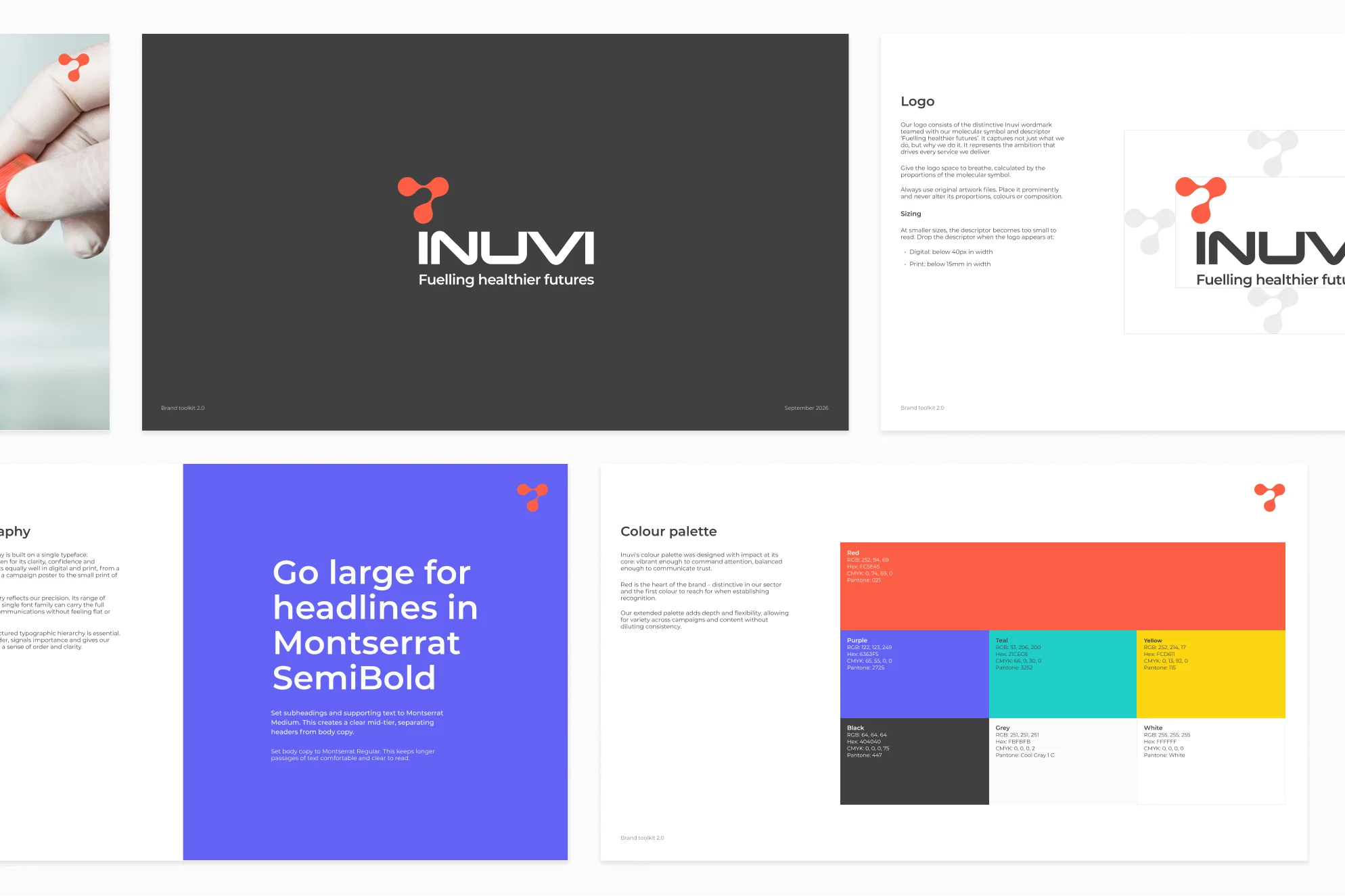
- A brand toolkit for leadership, marketing, sales and partners
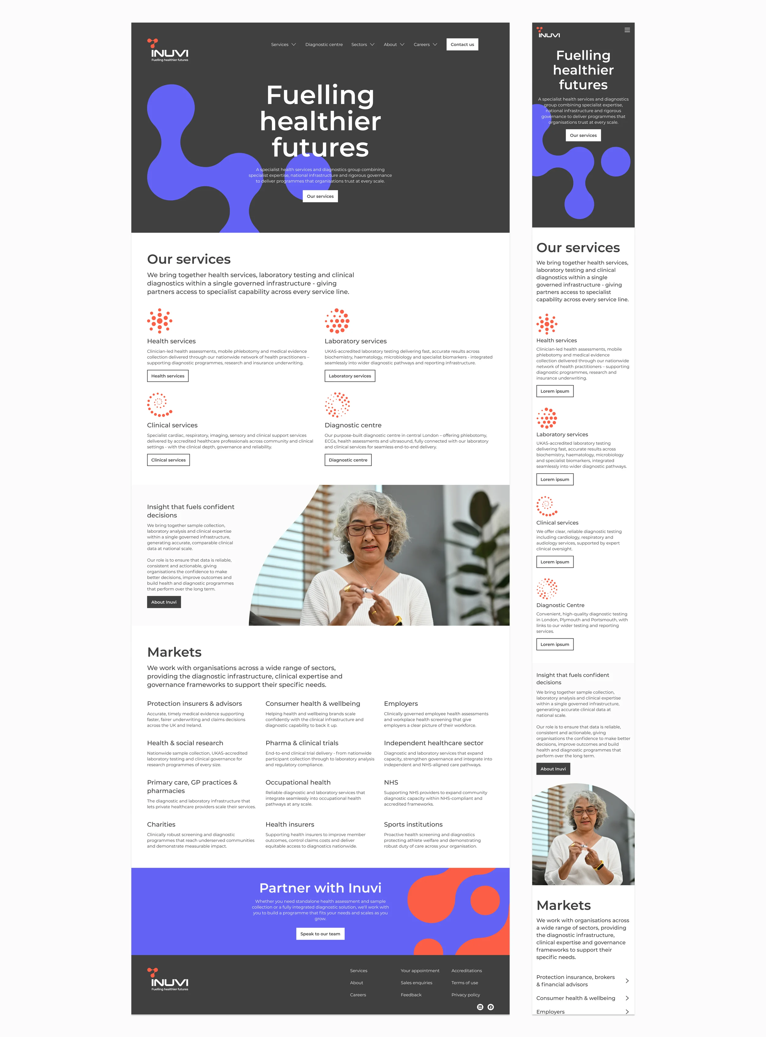
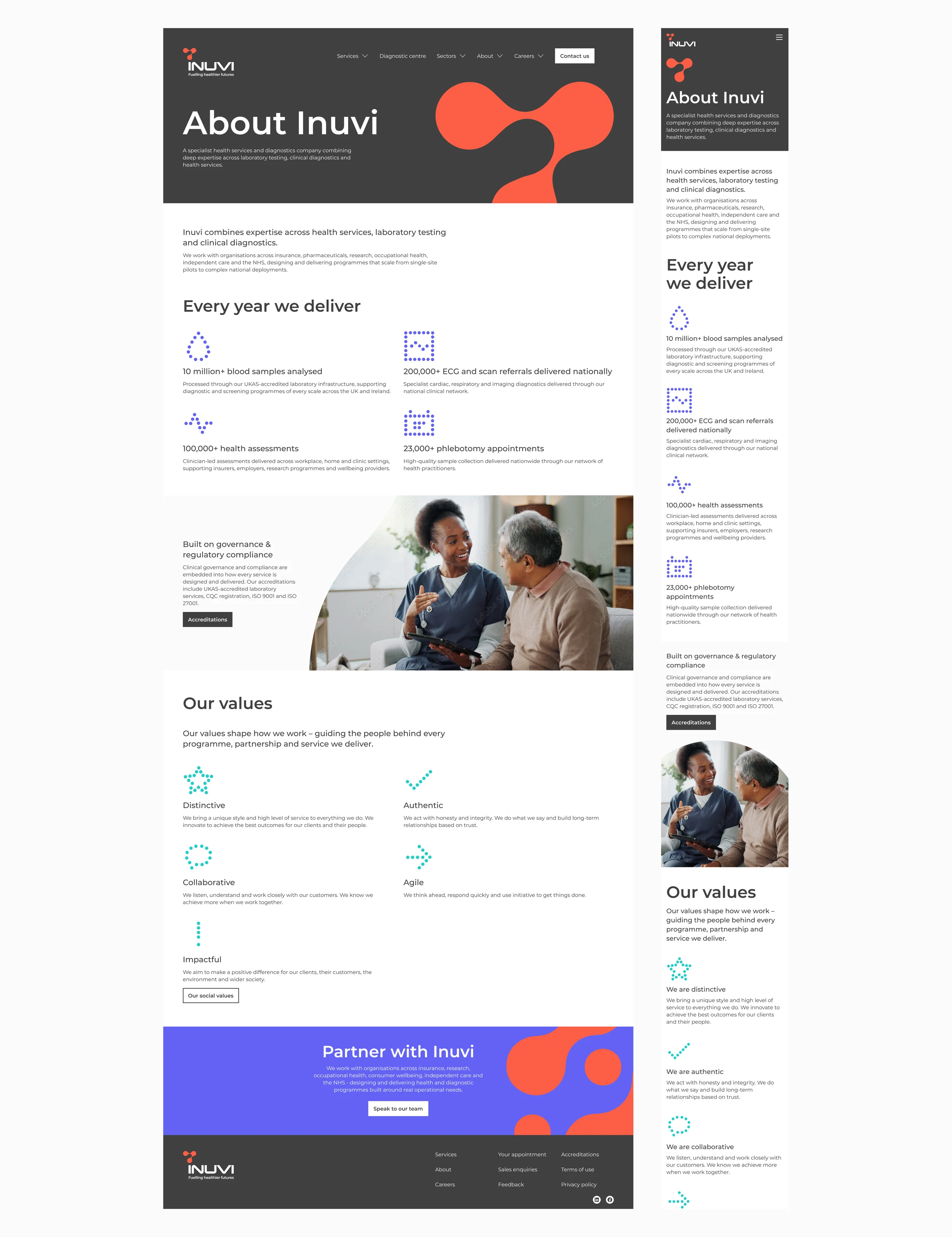
- A full redesign and rebuild of the Inuvi website, with a scalable design framework so new pages and companies can be added as the group grows
- Digital and print assets that carry the same visual language through clinics, marketing and partner materials
I’m working as part of a small, focused team, collaborating with Inuvi’s in-house development team on the website build.
Audience
Inuvi works across 12 markets, from protection insurers, health insurers and employers to the NHS, pharma and clinical trials, health and social research, charities and sports institutions.
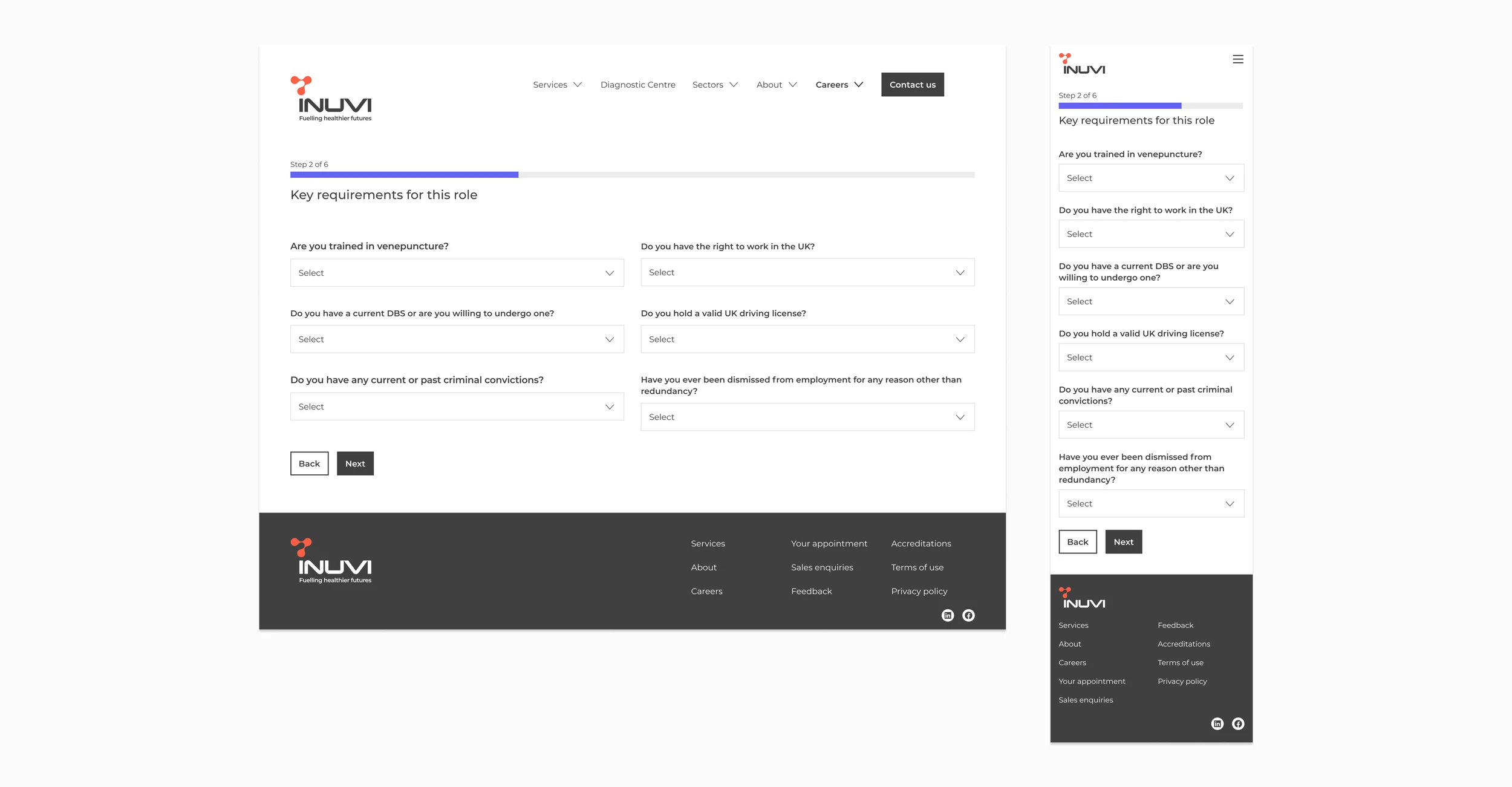
The website also serves health practitioners exploring joining the Inuvi network, individuals accessing their results through the LiveSmart platform, and visitors who need to quickly understand Inuvi’s role, credibility and impact.
Old website
Through acquisition and growth, Inuvi had brought several specialist services together under one group, and the old website no longer reflected that. Its branding contained strong elements but had become fragmented and diluted, and the site didn’t tell one clear story about who Inuvi is and what it does.
Brand identity
The refreshed identity is built around one idea: One Inuvi. A single, unified brand that connects every service line and reflects the ambition to fuel healthier futures.
Logo
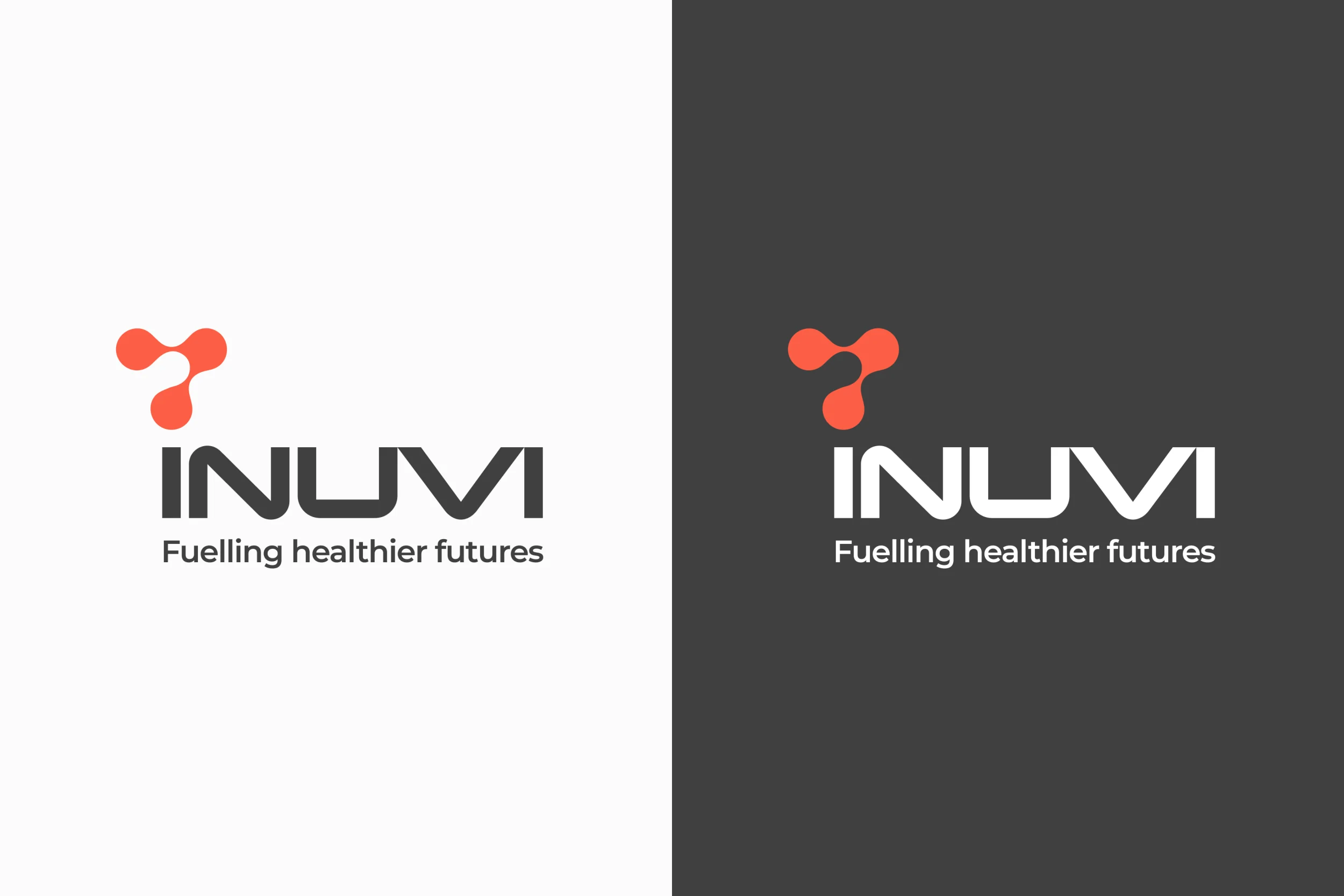
The logo pairs the Inuvi wordmark with the molecular symbol and the descriptor ‘Fuelling healthier futures’, a refreshed version of their legacy logo by Design by PH. Used on its own, the symbol works as shorthand for Inuvi, from app icons and favicons to a subtle accent on branded documents.
Typography
Inuvi’s typography is built on a single typeface, Montserrat, chosen for its clarity, confidence and versatility across digital and print. Headlines are set large in SemiBold, with Regular for body copy.
Colour palette
Red is the heart of the brand, supported by purple, teal and yellow, with black, grey and white. I set out approved colour pairings, so every combination is easy to read and passes accessibility checks.
Icons
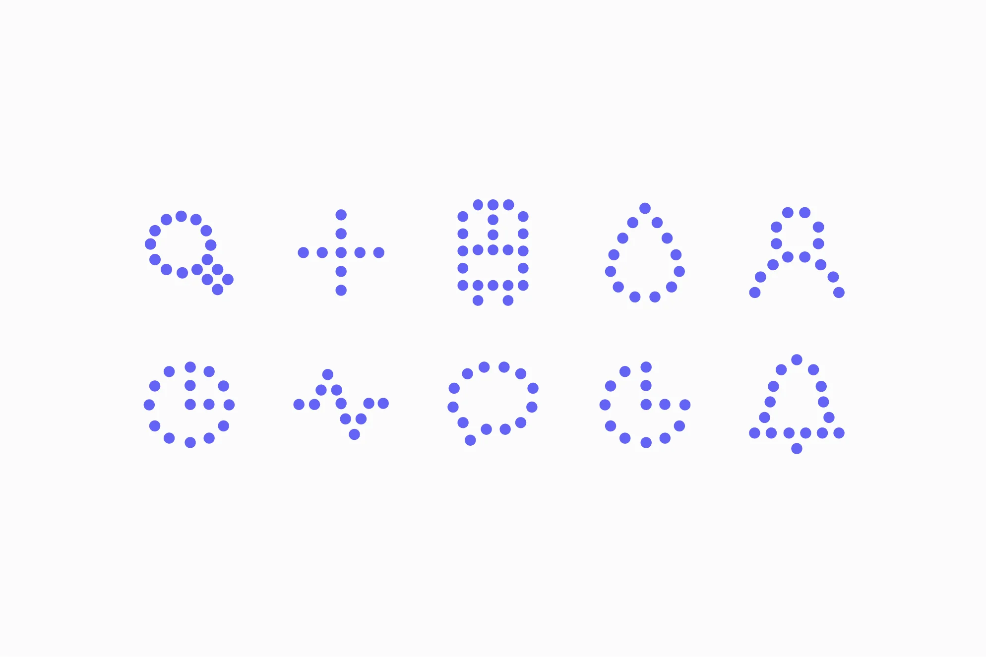
Made up of dots, the icons tell the story from a single drop of blood to a single source of insight.
Photographic style
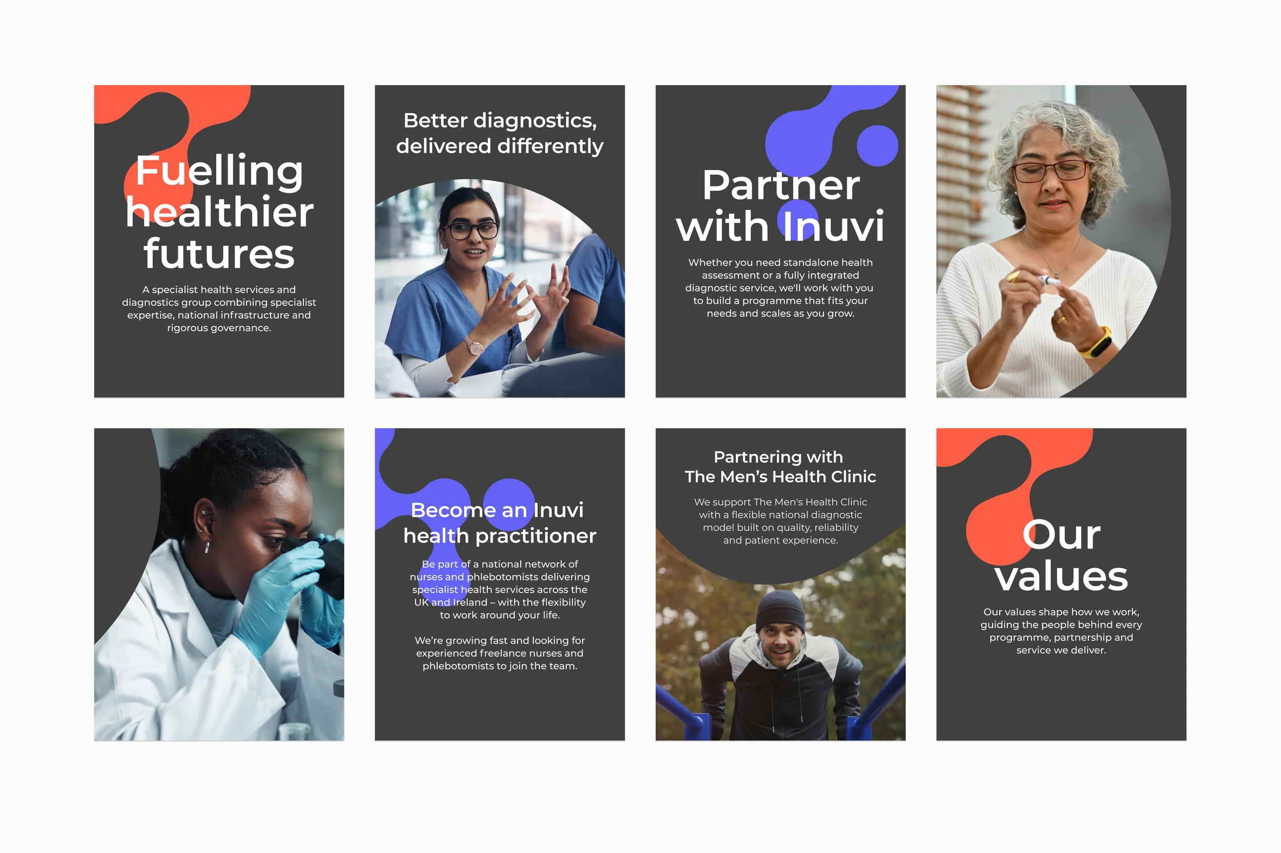
Photography leads with people, balancing clinical confidence with human warmth. The distinctive shape of the molecular symbol is used as an image container across branded materials.


Tone of voice
Inuvi’s voice is a trusted expert: knowledgeable without being clinical and warm without being informal. It’s built on four qualities: precise, progressive, purposeful and human.
Brand toolkit
Website designs
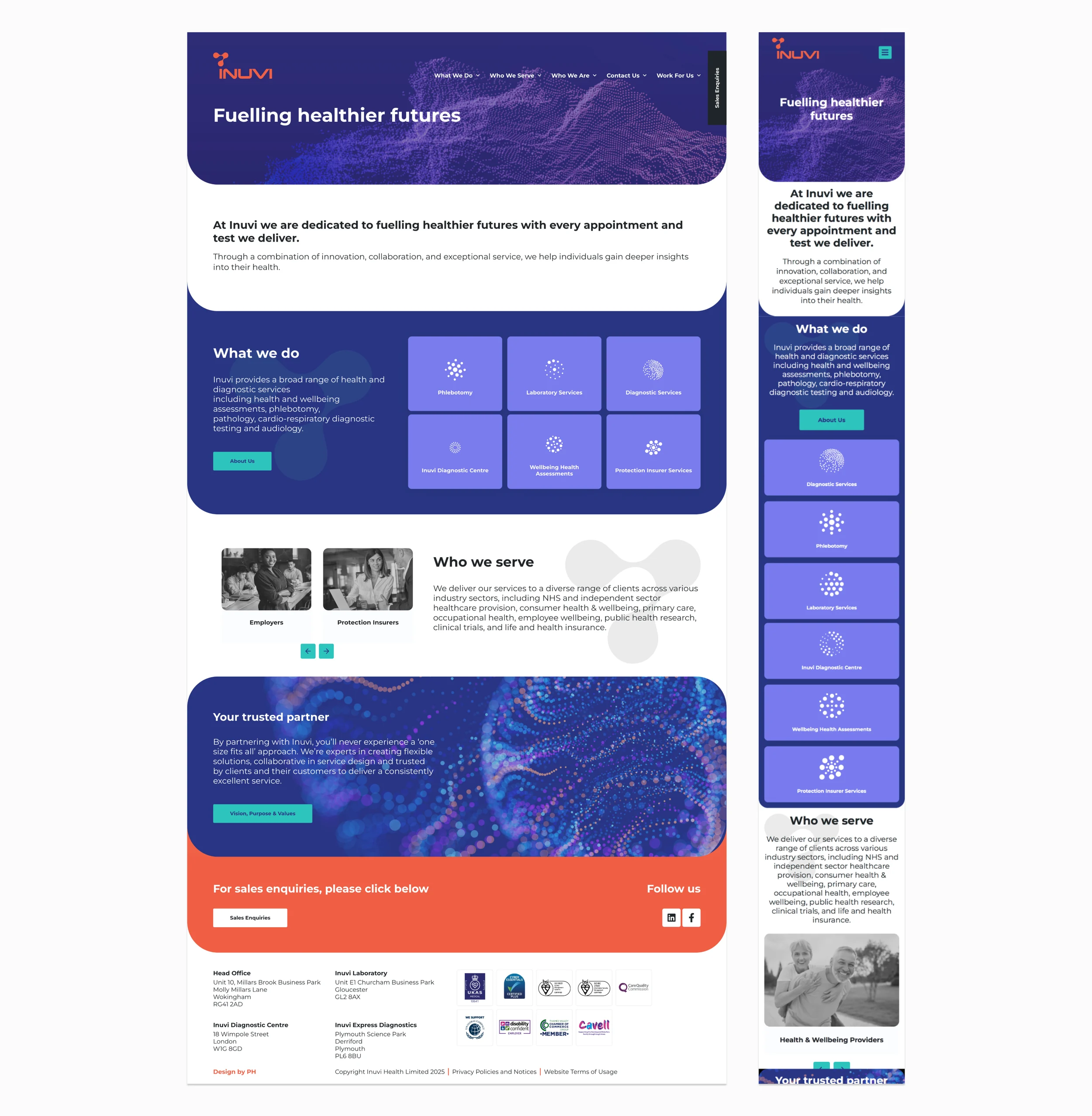
The Inuvi website brings every service line together in one place, using a scalable, auto-layout design framework so new pages and content can be added easily.
Digital design
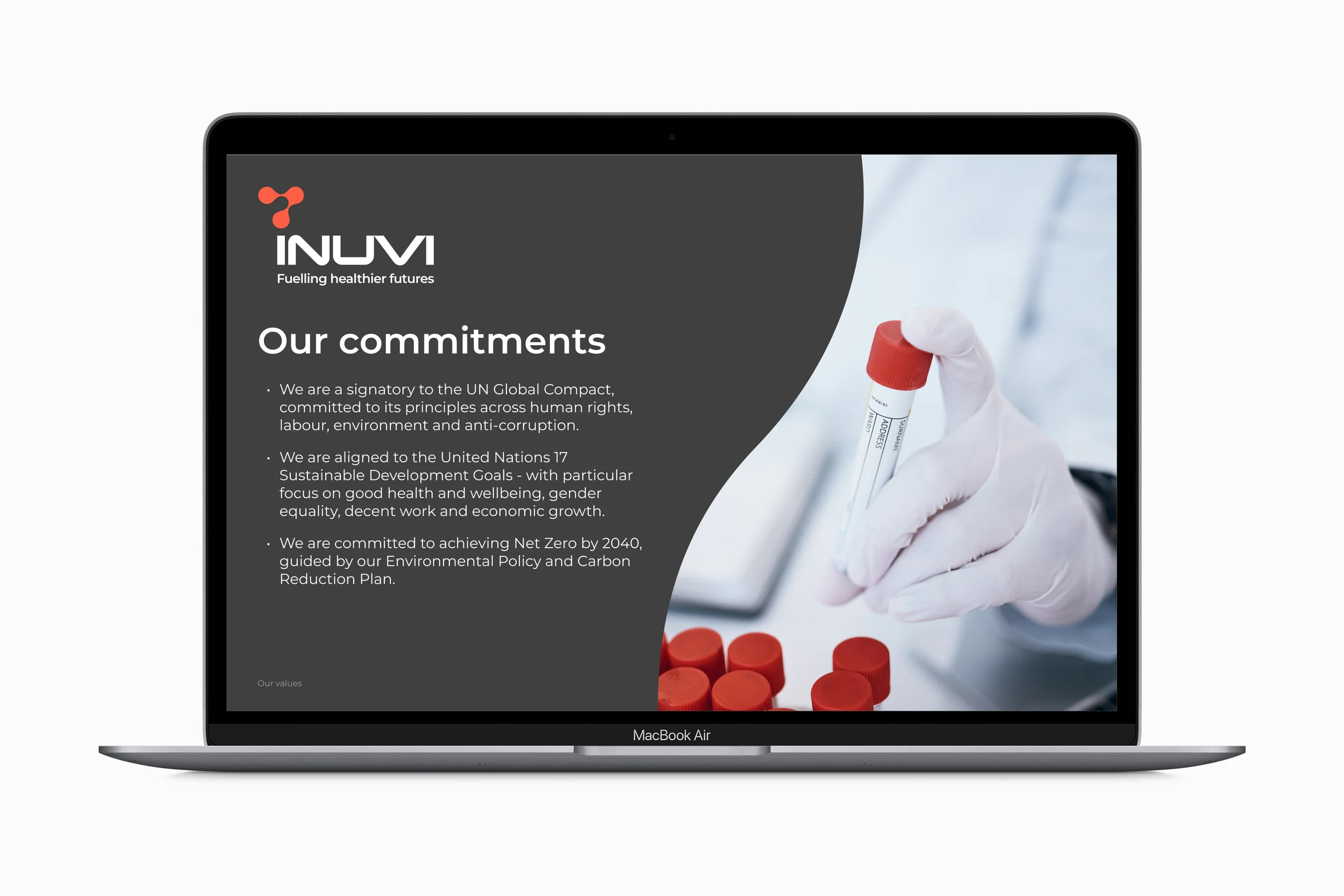
Slide deck
Social media
Print design
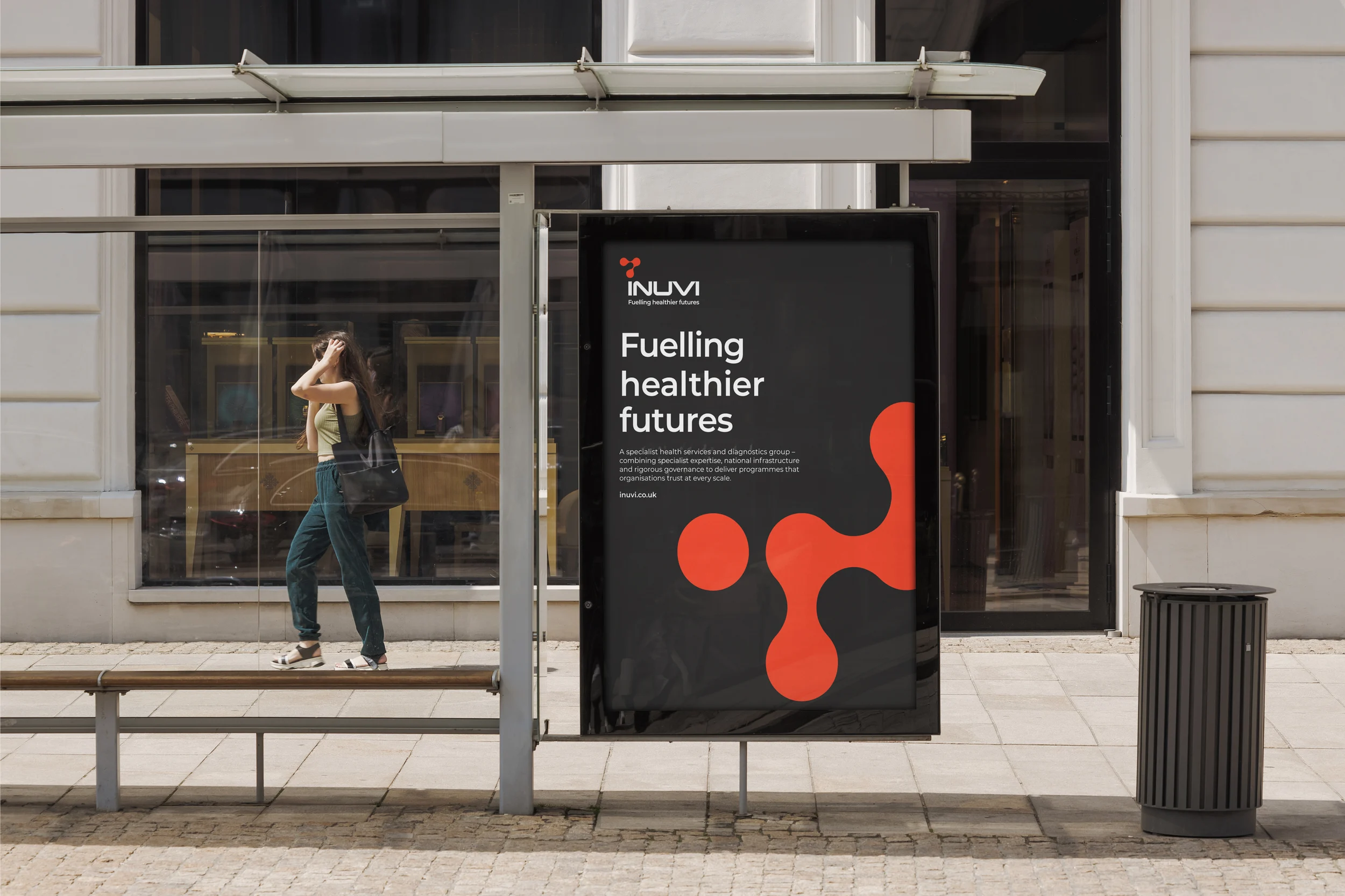
Posters
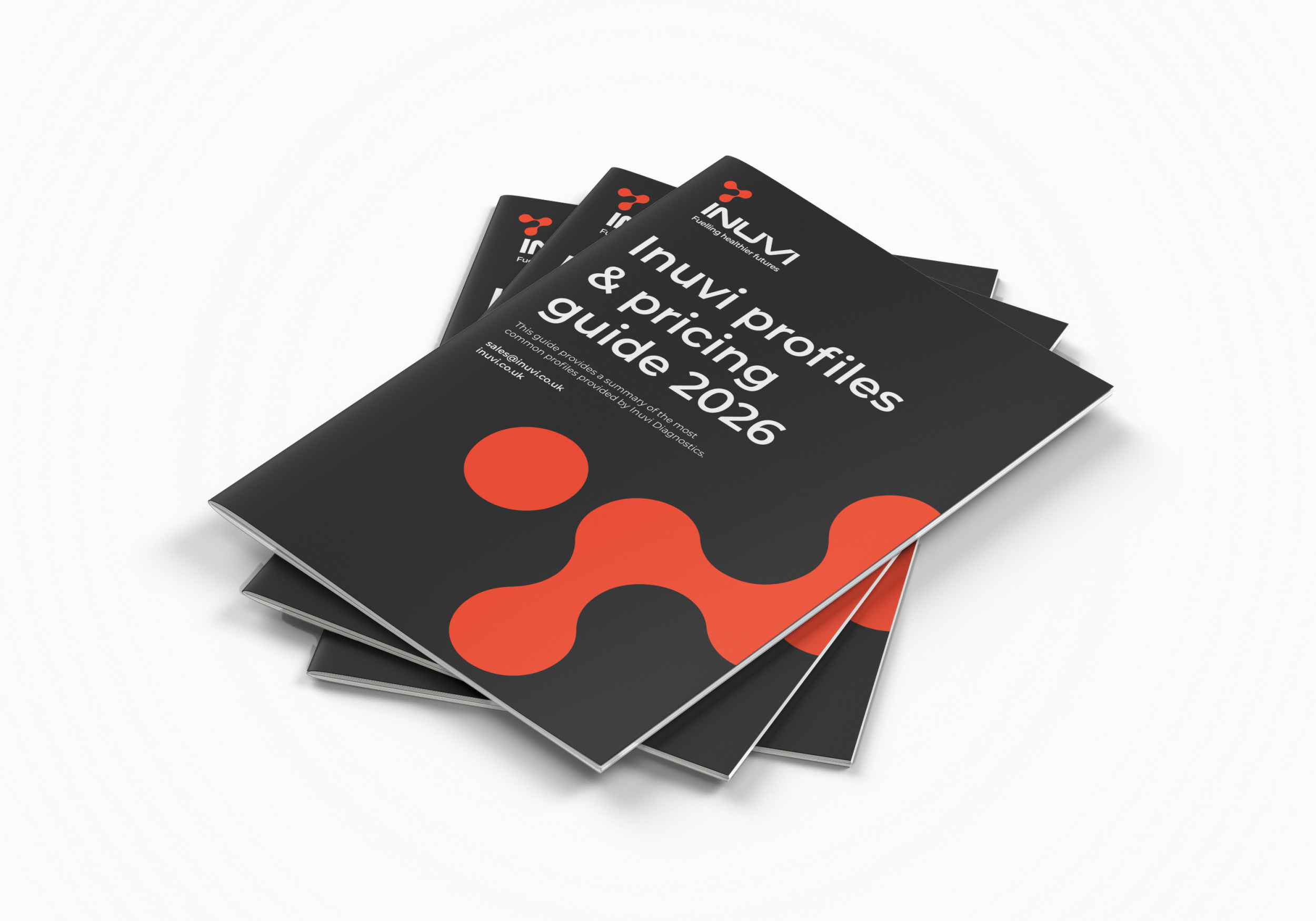
Pricing guide